

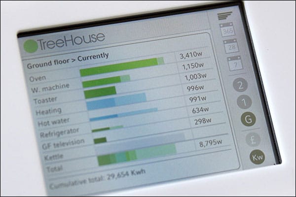
Quick post about the BBC’s story on Smart Meters - the meters, designed by More Associates show you exactly where all your energy is going. The theory (and practice, it seems) being that when you know what you’re using, you use less.
It’s a good example of how decent interface design (not to mention a smart idea) can help you re-interpret data in a meaningful way.
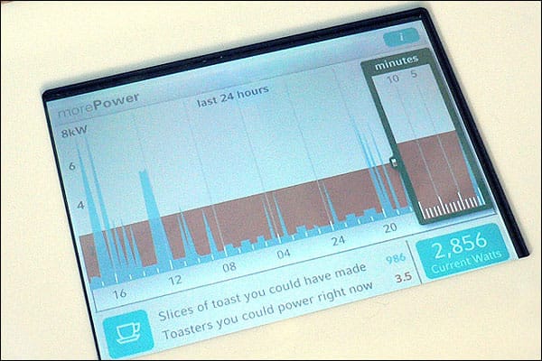
The second screen shows you what you could have done with that energy instead. Rather like the ideas in Change the World for a Fiver (a book I encourage everyone to buy - at least visit the website). Simple ideas, well communicated.
Whilst you are at it, check out the link on the BBC story about how appliances on standby use up energy. It’s pretty shocking:
[Norman Baker, the Liberal Democrat’s environment spokesman] has calculated that the CO2 emissions from electrical equipment being left on standby are equivalent to 1.4 million long-haul flights.
So, now I just need to turn everything off for about ten years to make up for all those flights to and from Australia…
Thanks to the good people at Worldchanging.com for the link.
Images More Associates.