

Ever noticed that the usual world map you see in atlases doesn’t really reflect the land-mass of the countries (the Northern Hemisphere countries are actually much smaller that they look). What about representing the world in relation to, say, the export/import of clothes. That is exactly what the Worldmapper website does.
Below is the the clothing import map (click to enlarge):
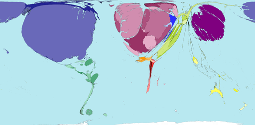
From the Worldmapper site:
Despite the vast range of clothing styles throughout the world, there is a large international trade in clothes. These clothes arrive, more often than not, in the United States, Western Europe and Japan.
Most clothes are made in territories where employers can pay low labour costs, which partially maintains low prices for the populations of importing territories.
(Japan is the big, purple warped blob on the right there if you were wondering).
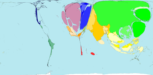
And here is the clothing export map:
Shame they don’t have one of the world distribution of wealth to complete the picture. There are plenty more though, go and take a look.
Thanks to the folks at WorldChanging.com for the Worldmapper link via BLDG BLOG.