

Google and the United Nations Environmental Programme last week launched an addition to Google Earth called the Atlas of Our Changing Environment, which allows people to view images of environmental change and information overlaid onto the satellite images.
You can access them from the ‘Featured Content’ section of Google Earth, or you can look at the web version.
I find this convergence of interaction/information design and environmental/sustainability issues really interesting because a large part of the problem is making this stuff meaningful and visible to everyday people and hooks into the work we’re trying to do at the Omnium Creative Network. It goes to show that good visual design (and of course the data) can really have an impact.
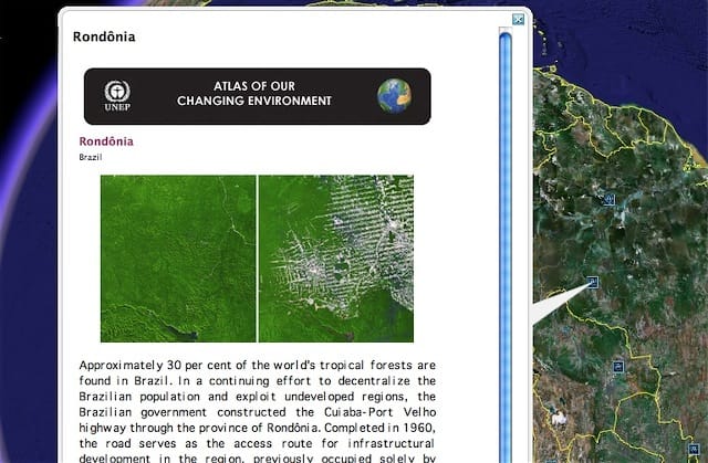
I’ve known about the scale of deforestation in the Amazon for years, all the stats on football pitch sized patches being destroyed every hour, etc. But it’s not until you see an image like this (and you can get the 1970’s image overlaid too, to compare) that you really appreciate how awful it is. Most of these images from Rondônia are from about 500 miles up too. From the overlay info:
In 1975, the region was still relatively pristine, with much of the forest intact. By 1989, the distinctive fishbone pattern of forest exploitation had appeared and by 2001 had expanded dramatically.
Shocking. As are almost all of the before and after images.