

Is it just me or does anyone else find LinkedIn’s new design tweaks weird on the perspective front?
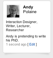
This rounded-corner box has a couple of random shadows at the bottom. The impression is that the bottom corners are lifting up, but the box remains square and the top has no shadows. Logically, that can only mean that the background curves away from the box, except it has no gradient or shadows either.
It really niggles me for some reason and does my eyes in like some crazy M. C. Escher picture. Or am I being too anal?