

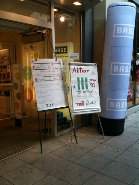
You have spent thousands on your corporate branding, you keep a tight reign over the usage of your logo, you ship out expensively produced marketing materials to your franchise affiliates and… they ruin it all by creating crappily hand-drawn signs and sticking them in the doorway of the shop.
This is a trend that I have seen all over the place in Germany. I’m not sure how it started, but it is an awful touchpoint. It doesn’t even have a bit of “human personality charm” to it. It’s simply bad branding and confusing (what does that bar graph mean?). Worst of all, it kills off any other brand coherency that all the proper materials might offer.
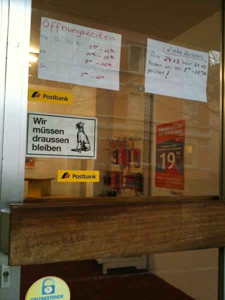
This one is for my local post office. Deutsche Post have a similar official and franchise model to mobile telco stores and despite the branding guidelines that I am sure exist, this post office’s opening times look like they were drawn by a 10 year-old. Even an awful Word doc typeset in Ariel would be an improvement on this – home printers are ubiquitous these days. Oh yes, don’t forget this is a bank (Postbank) too. Would you trust your money with them?