Navigating the Leadership Dip Book
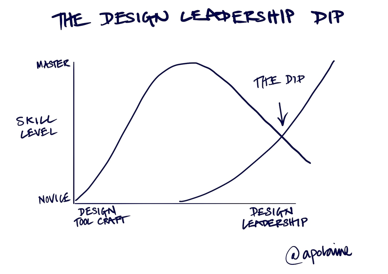
I’m planning a new book on the psychological experience of transitioning into creative leadership. From my coaching practice, I know the shift from IC to …


Design Leadership Coach, Service Design & Innovation Educator, Keynote Speaker, Writer, Podcaster
I’m planning a new book on the psychological experience of transitioning into creative leadership. From my coaching practice, I know the shift from IC to …
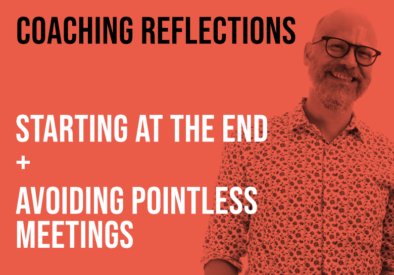
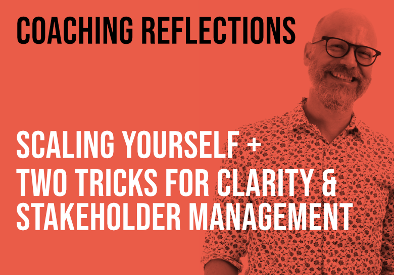
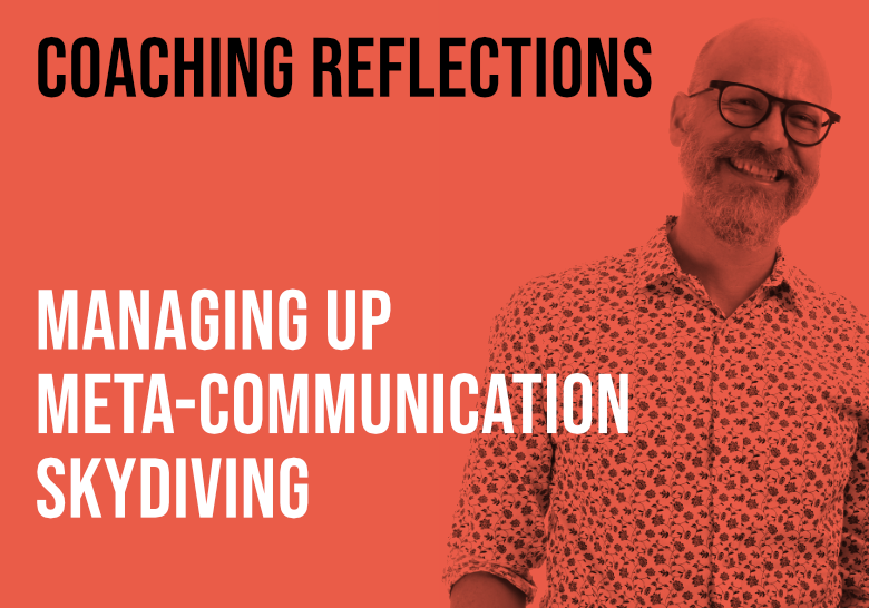
Every week I spend my days coaching design leaders. In these videos, I reflect …
Every week I spend my days coaching design leaders. And in these short videos, …
I spend my days coaching design leaders, helping them improve themselves and …
Although I have been mentoring designers of all levels for years as part of my …
I wrote a long essay in my newsletter about mediocrity and the current state …
As part of my book writing process, I have been putting out videos on my …
My guest in this episode is Indi Young, a solution strategist who uses purpose-focused qualitative data science. She created her method over a 30-year span, and teaches that method in courses, …
Subscribe to my newsletter, Doctor's Note