 Andy Polaine
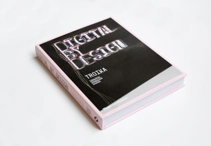
Troika have a new book out called Digital by Design: Crafting Technology for Products and Environments
I visited Troika a while back and interviewed for a Podcast on Core77 and really like their approach to what they do and they’re lovely people too.
I plan to review Digital by Design for the soon-to-be-launched Designers Review of Books, but in the meantime you can buy it from Amazon.co.uk here
I also wrote a profile on them in my Foreign Policy column for Desktop. It seemed a fitting time for another “From the Archives” interview post. You can read the full Desktop article after the jump…
Troika - Good things come in threes
Creating an original visual language in the digital age should be easy, but when we all use the same tools, sometimes everything looks the same. Troika are a multi-disciplinary art and design practice based in London who unusually work across graphic design, motion graphics, interactivity as well as engineering, art and sculpture. Their work constantly explores new aesthetics through innovative technological approaches.
The practice was founded in 2003 by Conny Freyer, Eva Rucki and Sebastien Noel, all of whom met at the Royal College of Art, and is perhaps most well-known for their recent work on British Airways new Terminal 5 at Heathrow. Although the opening of the terminal itself has been beset by organisational disasters with baggage going astray and passengers stranded Troikas _Cloud _and _All The Time In The World _installations have at least given travellers something to marvel at whilst they wait.
The cross-disciplinary nature of the practice came about through a mixture of friendship and being in the right place, says Noel. The Royal College is known for encouraging those kinds of discussions between disciplines. Like any university its like a playground where you meet people and you can exchange ideas between architects, designers, all sorts of people.
The combination of technical knowledge and creative approach go hand in hand, adds Rucki. I think you grow your work within certain boundaries and our work has always been about how far we can push the boundaries, what we can get away with within that.
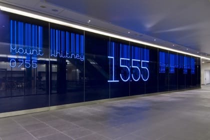
Photo (C) Alex Delfanne/Artwise Curators 2008
All The Time In The World is a 22-metre long wall at the entrance to the First Class and Concorde Galleries lounges in Terminal 5. Instead of the obvious world-clock locations such as Paris, London, New York, Troika wanted to give a sense of more exotic places in the world natural wonders such as the Great Barrier Reef or Mount Whitney bringing some romance back to travel.
Everything is grouped by the typology of places, like the highest mountains or biggest lakes, explains Noel. Theres even a stupid one that we came up with that began with Philadelphia, then it goes Corfu, Gouda, Roquefort all the places where cheeses are made.
The piece uses electroluminescent ink silk-screened onto a flexible transparent acetate and displayed behind a deep-blue glass wall. Although this technology has been around for a few years, Troika took it a step further by developing and patenting an approach that divided up the type into segments, each individually addressable and able to display different up to five different typefaces. The visible, glowing circuit is combined with the letters being animated by switching on the segments as if they are being drawn by an invisible hand. The result is a unique visual aesthetic, developed from the technical challenges as much as the creative approach.
Its not even so much the silk-screening process that is a challenge. Its more about how many circuits you can use and how refined you can then get the typeface. The typeface is built out of 67 circuits, or segments, for each letter. The letters appear by switching on different combinations of the segments within that cell. So the more segments you have the more refined the typeface can be, but also the more complicated the driving technology has to be, which were obviously trying to minimise, says Rucki.
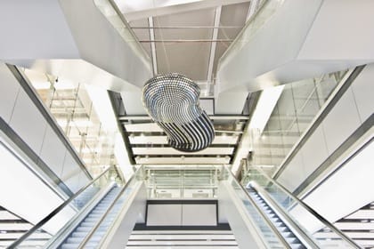
Photo © Alex Delfanne/Artwise Curators 2008
They faced a similar aesthetic and technical challenge with their work on Cloud, a five-metre long kinetic sculpture suspended above the atrium hall in Terminal 5 representing the transition from the earth to the sky when flying. The sculpture has an S-shape with a pillow-like profile - an organic shape full of compound curves covered with over 4,638 flip-dots. Whilst the curves give a sense of natural form, it provided a fair few production headaches in order to work out how to evenly tile the two-inch dots over the surface.
The electro-mechanical flip-dots were used because of their history of use on old departure and arrival displays and their analogue charm. We originally conceived of a structure with a sea of flip dots. They have this real materiality and make a distinctive clak, clak, clak! sound. When I close my eyes and imagine myself as a child going somewhere, this noise is always in the background, says Noel.
Troika had to persuade the manufacturer of the dots to make custom ones in order to be able to use the dots hanging upside-down or horizontally. The controllers of the dots themselves also use an old 1970s technology combined with modern circuits, which meant very specific cabling throughout the sculpture the innards are stuffed with circuit boards and over 5km of cabling.
Finally, having built this new display form, Troika had a chance to play with it and develop the aesthetic language. To help them with this process they built a 3D-model in Processing in order to work out the patterns to display on the Cloud.
Its very difficult to imagine how you are going to animate something thats like a screen but three-dimensional and non-regular, he says. There is no regular alignment, no grid system. So we work with a kind of peeled-out version of the cloud, like a two-dimensional map of the cloud and then the control software makes the relationship between the colour of the pixel and the dot on the physical object. Plus you have a lot of other things you have to think about that you dont have on a normal screen the time it takes a dot to flip, the sound it makes, all these different variables. You have to find the language of the medium.
We are all so used to working digitally with hundreds of typefaces on demand and almost infinite choice, that those of us who arent typographers forget what a challenge it is to not only create the design, but also the tools and the mechanism for displaying it. We can all learn something from this 21st century equivalent of creating your own quills and inks.
This article originally appeared in Desktop Magazine - July 2008 Issue 240. (C)2008 Andy Polaine