 Andy Polaine
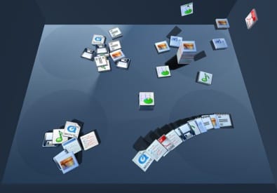
I was interested to see this video on YouTube for the BumpTop interface that mimics a ‘real’ desktop. Interested but disappointed.
The whole idea of a desktop metaphor is that it is a metaphor not the real thing. There are things about a real desktop that I really don’t like, like piles and piles of stuff to sift through. I realise that it is an interesting route to go down to try and emulate some of the physical signals of piles of paper (i.e. that one on the top at right angles is really important). But the solution isn’t to make it look more real.
BumpTop ends up creating more problems than it solves and seeing that it comes out of the Dynamic Graphics Project from the University of Toronto’s Computer Science department part of the reason why. It’s a great example of why you shouldn’t let computer scientists loose on interface design.
Granted, it is quite slick and cute, but it misses the point. I don’t need my visual metaphor to be given greater attention (all those little icons bouncing around like books). What is needed is metaphor of intention and Apple’s Exposé in OS X has already claimed that major leap in GUI design and most of the good parts of BumpTop.
What struck me about Exposé when I first used it was that it didn’t break the workflow (actually it enhanced it) whilst it did break the desktop metaphor. In the real world I can put documents into folders and sort them, etc. but I can’t make them all expand from a pile and hover in front of me and then ping back to a pile once I have chosen one. I struggled to work out why that was for a while and then it struck me that this is a metaphor for another kind of action, but it’s more about intention than the realism of the action. When you rifle through papers, half lifting the edges of a stack of magazines, for example, you get enough information to recognise the thing you want. Often that’s just the colour or a part of an image or a single word or two. You drag it out of the middle of the pile without unravelling everything and drop the edges back down again.
So that part is quite similar to the action of displaying all your open documents in Exposé, albeit a bit more abstracted in the GUI, which is again the point of a GUI. The ability to clear your ‘desk’ of everything magically and then have it all back in the order it was again is one of intention - something you’d love to be able to do in real life, but can’t. If you get that right, you have a great GUI. If you focus on the literal translation of the real world then, well, you get all it’s problems.
In their paper the BumpTop authors, Anand Agarawala and Ravin Balakrishnan, realise this at the very end:
Like the GUI desktop, our prototype runs into problems when the number of items gets large. As Whittaker et al. (2001) found, “the main limitation of [piling] was that it did not scale well: pilers found difficulties accessing information once piles had begun to multiply. We intend to explore extensions that might deviate somewhat from the physical piling metaphor but benefit from leveraging the underlying computer.
That’ll be the abstraction of a GUI they’re after. Here is a totally different example of something simple working very well indeed (and okay, they’re computer scientists too, can’t you tell by the thrilling presentation techniques?):
(That last one via Knotty).
p.s. For the anal and academically minded, that Whittaker reference above is: Whittaker, S. & Hirschberg, J. (2001). The character, value, and management of personal paper archives. ACM Trans on CHI, 8(2). p. 150-170