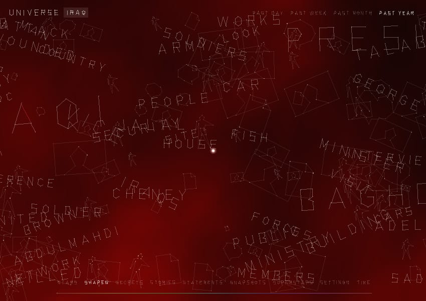
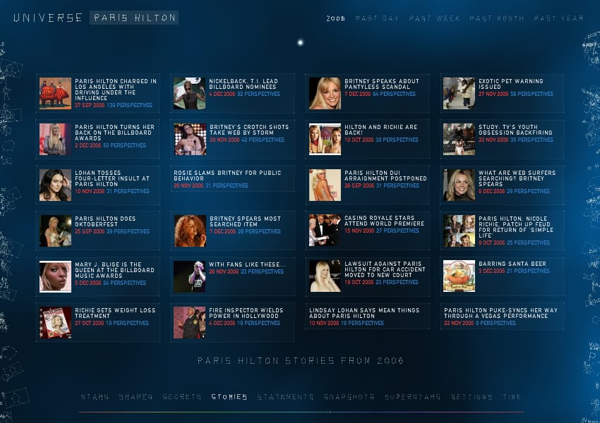
I’ve written a few times about the work of Jonathan Harris and We Feel Fine remains one of my favourite combinations of data visualisation combined with a brilliant interface that gives an insight into that data’s meaning.


His new project is called Universe, a piece he has created for the interconnected news service, Daylife, where he is Design Director. Once again it explores the interconnected nature of all our lives:
In Universe, as in reality, everything is connected. No event happens in isolation. No company exists in a vacuum. No person lives alone. Whereas news is often presented as a series of unrelated static events, Universe strives to show the broader narrative that contains those events. The only way to begin to see the mythic nature of today’s world is to surface its connections, patterns, and themes. When this happens, we begin to see common threads — myths, really — twisting through the stream of information.
It is also another work of Processing art and he combines a wonderful interface with an insights into the morass of data that we usually become overwhelmed with. He seems to be going from strength to strength and recently showed Universe at the prestigious 2007 TED conference.
I’ve only just noticed that he has a computer science background - so it just goes to show that not all computer scientists are awful designers. Whatever he learned needs at Princeton to be spread around the other CompSci courses in the world.

